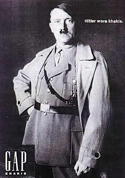
One of the most interesting application of the semiotic theory and the various functions in it, I find; are in the area of graphic design, and posters in advertisements in particular. The more minimalistic the poster in terms of the elements that make up the poster, the more meaning it makes and the more the viewer is forced to hunt for the signifiers and also make meaning out of it.
Disclaimer: This is a parody for a GAP Khakis advertisement. I am pretty sure this is not an authentic GAP ad. I just happened to come across this on the internet. The idea behind this post is to see how a semiotic understanding of the parody posters could send in negative as well as positive vibes with the audience.

referential (content)
An advertisement poster for GAP Khakis.
metalingual (code)
The text (Hitler wore khakis) that supports (or reinforces) the statement made by the central character in the frame.
formal (form)
The form is a poster that is either in print or on web medium. It is not known which one it was first made in. It is a nevertheless a bold cultural expression. The absence of color makes the statement more prominent. The user is forced to get their attention on the chief components of the frame.
The first attention is on the face and the stature of the man (placing his hands on the hips- a signifier of achievement, and dictatorship).
Then if your attention digresses towards the top, it is making a strong statement – “Hitler wore Khakis”.
And if your focus digresses towards the down, then there is the brand name – “GAP KHAKIS”.
Either way a statement is being made.
expressive (addresser)
The addresser here is GAP, the garment company. The designer who designed the poster is the sender but what the public sees, is a projection from the company GAP. So the addresser here is actually the company as a whole and not necessarily one person.
phatic (contact)
Users engage in viewing the artifact. There is a lot of deciphering that is happening at the cognitive level because of the elements in the frame. The viewer is not only forced to think in a denotative manner as to what in the poster, but also connotatively in terms of what the person stood for.
conative (addressee)
The addressees are potential buyers of the brand’s clothings. Its target customers are younger generations. By using the icon of Hitler, there is a conscious effort on the addresser part to focus on the current youth generation.
contextual (situation)
The situation in this case is a website (presuming that the poster is an internet ad). The company has chosen a controversial figure like Hitler to make a statement. It is a statement of power, of confidence, of dictatorship, of arrogance and pride. The stature makes that bold statement and allows the user to agree upon the fact that a person of this status wore Khakis.The addressee is expected to wear the GAP clothing with the same amount of pride.
The use of a prominent historical figure in their advertisements (also done by Apple a lot) is perhaps an attempt to make the advertisements move away from the cultural significance. It is to use the ideologies that the person was famous for, in bringing about the resonance with the company’s values and ideologies. So when GAP uses Hitler or Apple uses Gandhi, it is to appreciate the good things that these prominent figures stood for.
Having said that, companies should be very certain about the usage of figures in the cultural context. Religious sentiments were hurt, when some leading American brand portrayed the Hindu gods on lingerie ads. Similarly a GAP ad featuring Hitler, would not be prominent to be released in a Jews dominated areas. Time and again we hear of people protesting the usage of a particular brands in relation to the cultural significance.
Since this advertisement (in the form of a parody) has been there on the internet, it is been influencing addressees and that could be a reason why their sales could have gone down (if at all i.e. ).