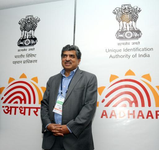
In one of my earlier posts, I had written about analyzing logos by using Semiotic Theory. What it basically was to take a closer understanding through different point of views related to the viewer, the designer, etc. Of late one notices that even the governments have been interested in getting their logos designed, and seeking inputs from designers. It is a healthy sign indeed. One such example is the Government of India working hard on the Unique Identification Project under the name of Unique Identification Authority of India and headed by former Infosys co-founder, Nandan Nilekani.

Nandan Nilekani launching the new logo and name
They recently had a new name (Aadhaar) to the whole project and a new logo unveiled.
I am going to do a critical analysis of this logo based on the semiotic theory and seeking the explanations from the phenomenological understanding that I have developed over the years of designing logos and branding solutions.
To start with, when trying to understand the semiotics behind the logo, one first has to understand the referential function i.e. the content of what the logo is composed. The Aadhaar logo is primarily composed of three parts namely, the sun and the finger print and the text below the logo. There are two prime signs in the logo in terms of the imagery. These signs signify certain attributes independently and then as a collective they have a different meaning. While doing a critical analysis, it is important that we understand the signified meaning of all the individual signs and what they signify and then finally the overall logo.
Being an Indian, I understand that the association with the Sun is perhaps more than any celestial body out there. The sun is an element that is worshiped across the country and hold an important cultural significance in the state of things here. Metaphorically a sun would signify brightness, progress, sunshine and the ray of hope in a dark world. At the back of the mind one is also thinking progress and the development of the masses. The aim of the project is indeed to do that. Things like getting identity, removing irregularities in ration cards, and other loan procedures, for the primarily rural audience is a big goal of this project.
The number 7 again holds an important status in the Hindu Mythology, and that could be an explanation for the seven rays of the sun. The shape of the says of the sun has a motif that is inspired from the lotus petals and that too has some significance in the Hindu mythology. Based on these points, one may get the impression that it is a non-secular logo, but looking at the universality of the sun, it is best to assume secularity in the logo.
One of the key aspects when looking at the logo is the sender-receiver relation. The sender in this case is the government of India, who owns the project, and the receiver of the information (and the meaning) is the public and the citizens of the country. You want a logo that is easy to identify, and hence the sun and the finger prints have been used. Both of them are easy to identify with the audience (which is an Indian audience) that we are looking at.
However notice that at some point of time the finger print actually morphed itself graphically into patterns. he abstraction leads to it becoming a pattern instead of just a finger print. This is good, as the project uses not only finger prints; but also iris patterns, and therefore a graphic representation of the pattern was required.
The presence of the similar names (do a Google search on Aadhaar and see the results you get) , as compared to a totally new word (which would have come about if UADAI was used to create the logo) could create some confusion in the initial days, but it will be overcome by the mass usage of Aadhaar for this project. The choice of the name is smart, as the word can be found across languages and is easy to connect with a larger pool of people. Having its root in the Sanskrit language definitely has a wider reach, but still misses out on a few pockets.
I am not to impressed with the choice of colors here. The red and yellow gives it a communist feel to it and could lead to some controversies. Would love to see more of the India blue, or the usage of the saffron in the logos. The red being so dominant a color, the yellow / orange is totally overshadowed and its only when you come near to the logo that you notice the sun’s halo.
Overall, I feel there could have been a better design, but I think to start off with this is a good choice. Once the project is up and running and the word Aadhaar is on everyone’s talk, there can always be a redesign of it. I congratulate the designer of the logo and the government for working on this project and valuing designers!
Cheers!
hi kshitiz,
thanks for the logo analysis.
the idea about using red b deep yellow is
very direct n simple. both are bright and
vibrant colours. which deliver freshness and evoke enthusiasm. one should feel fresh and a bit
excited while watching it. here significance of deep yellow is for gaining knowledge and red signifies community involvement. thanks once again for the logo analysis.
Thanks for the comment Atul !

I like the usage of the colors no doubt, however I would definitely want to see a pinch of blue. But then as they say, design is subjective, and I am a little biased towards blue.
That’s very insightful.
The analysis is very good.
that’s very super. .