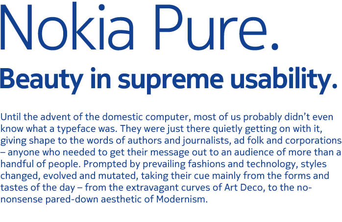
So, Nokia has decided to let go of its iconic font the Nokia Sans that adorned its handsets and website and other materials for quite sometime, and replace it with Nokia Pure.
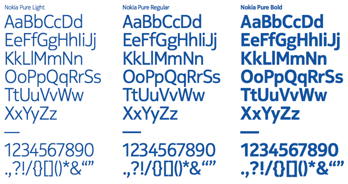
Here the entire suit of fonts to see.
I love the fact that they are really putting the word usability at the core of things.
The move could also be seen as a step to to align its branding with the decision to move to Windows Phone platform, where they use the Segoe WP font.
Also got to see this video from the Font Designer’s workshop where the font was created! Super video this one!
PureReversal from Build on Vimeo.

