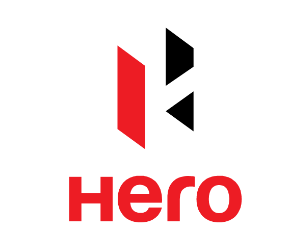
A lot has been going on in the corporates, with many tie-ups and mergers. These activities are resulting in a lot of identity being changed and new ones being formed. Change is required for a company to grow. And identities are often a key part of the entire makeover process.
Recently Hero Honda went through one such change, and has now re-branded itself at the Hero Moto Corp. It also introduced its new logo.
Here’s the design brief for the logo design :
“The new logo stands for the new face of India – that youthful energy and ‘can do’ spirit. It is in true sense the “Indian Catapult” which signals that while it is deeply rooted in Indian values, it is also poised to go for global expansion – a Leap of Faith.”

The new Hero logo
My initial thoughts on this was definitely not positive, as the logo as such was a bit difficult to comprehend. The logo is definitely contemporary, especially with the font it has used. But then that was the case with another recent logo fiasco, the Airtel one.
This new Hero Moto corp logo has two components to it. One is the graphic part and the other is the text / typographic part.
The graphic part in this case is a 3D one.
The beauty of this logo is that it is simple. It’s easy to reproduce. But thats about it. I have more things to say that are not in its favour.
The problem with 3D logos that play with the concept of positive and negative space is that often it is un-noticed. And even to experts, it becomes obvious only after spending some time staring at it. So it is not surprising that many failed to notice the H that is being formed. When I first saw it, I was unable to see the H part. Only after seeing it for some time, you notice the H. The impact of the logo is not 100%, and therefore loses an opportunity to have a good impression on the viewer.
Having said that, once you see the H, then it is becomes obvious.
Overall I am also a bit surprised at the choice of dual color color in its graphical element. In my opinion just a monocolor logo would have worked better here. The way I see it, one has to understand where all the logo would be used, when deciding on whether to use a single color of dual color. It this was going to be used only on the print / web mediun, I do not see a problem with the choice. However, when you are looking to use the logo in a metal form on the vehicles that the company would manufacture, the difference between the red and black is lost. I am really eager to see how the logo plays out when it is used on the vehicles.
In my opinion, the logo also has two negative connotations.
The first is the choice of colors. It is baffling to me. In a country like India, and the brand that Hero group is over here, the usage of black in the logo would have been unthinkable to me. Amongst the few connotations that one associates with the color black is death, depression, sign of negative, a showing of protest. I like the usage of red, but again that has a more communist feel to it than anything else, especially in the form in which it is used.
Did you also notice that the logo has a back arrow? I fail to understand, how on earth, can a motor company that is a market leader, use a graphic element of such obvious negative connotation. In case you have still not seen it, this is formed in the right bottom graphic that forms a back arrow.
I personally do not like it. But in the end we all know that it would stay, and we get used to it.
Here is the T V Commercial that was launched with the Brand change.